How to Choose the Best Decorative Paper Sheets?
Choosing Decorative Paper Sheets is not only a matter of color. The right sheet should suit its purpose, handling, and setting. A pale, lightly textured paper may soften a handmade invitation, while a glossy metallic sheet can bring energy to a gift wrap. Yet that shine may feel excessive on a small label. Small details matter.
The designer William Morris offered a useful principle: “Have nothing in your houses that you do not know to be useful, or believe to be beautiful.” Morris was not speaking specifically about paper, but his view of decorative design can guide a practical choice. Ask what the sheet needs to do. Will it be folded, glued, printed, or left untouched? Check its weight, surface, opacity, and compatibility with your tools. A sample is worth handling. Screens can mislead.
Then compare color and texture in the light where the finished piece will be seen. Look for uneven coating, fragile edges, or patterns that compete with your design. A paper that looks elegant in a product photo may feel too slick in the hand. I would not choose from appearance alone; still, appearance is hard to ignore. There is a trade-off. This guide explores how to balance visual appeal with durability, ease of use, and budget, so your Decorative Paper Sheets feel considered rather than merely attractive.
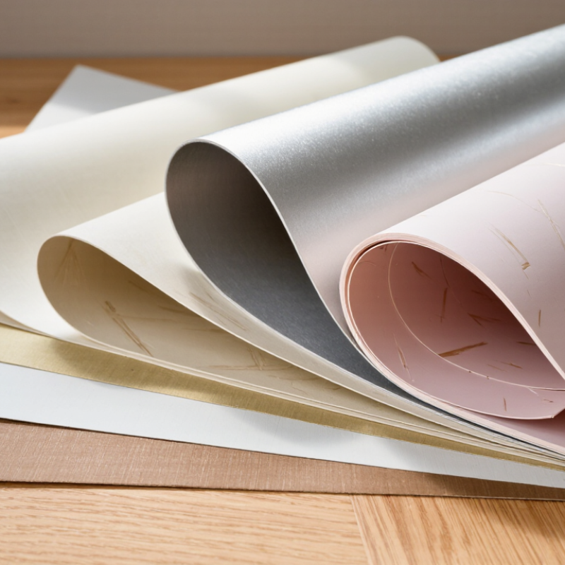
Define the Intended Use, Format, and Finish Before Comparing Decorative Papers
Before comparing colors or patterns, decide what the paper must do. Gift wrapping needs enough flexibility to fold around sharp corners without splitting. Scrapbook pages may need a smoother surface for writing and photographs. For drawer lining or a display backdrop, measure the area and consider how the paper will be attached. A beautiful sheet is less useful if it wrinkles during installation.
Then choose a format that fits the project. Check sheet dimensions, thickness, and whether the paper is sold individually or in a pack. Large sheets reduce seams on broad surfaces, while smaller sheets can make testing patterns easier. If you are covering a curved box, handle a sample first. Stiff paper can crease where you least want it. I have sometimes guessed from product photos and regretted it.
Finish changes both appearance and handling. Matte paper can soften glare and make handwritten details easier to read. Glossy finishes reflect light, but fingerprints may show more clearly. Raised or textured surfaces add depth; they can also make cutting and gluing less predictable. Test a small piece with your intended adhesive and pen. Check care and material details when the project needs specific durability or archival qualities. That small check can save a whole sheet.
Compare Grammage in g/m² Using the ISO 536 Measurement Method
Grammage is the mass of a sheet per unit area, expressed in g/m²; it is not thickness. ISO 536:2019 specifies a method for determining grammage by weighing paper specimens of known area. For a simple illustration, a 10 × 10 cm sample weighing 1.2 g equals 120 g/m². Small samples matter.
Compare decorative papers after consistent conditioning and sampling, since moisture and uneven coatings can affect readings. Weigh several specimens, calculate the average, and record variation instead of trusting one result. It is tempting to equate heavier with sturdier; that shortcut can mislead. Surface finish, fiber composition, and caliper also influence folding, printing, and handling. Try a fold test for the intended use.
A shared measurement method helps make specifications comparable. CEPI’s 2023 Key Statistics reported 79.2 million tonnes of European paper and board production. That broad industry figure is not decorative-paper data, but it shows the scale of paper production. Treat it as context, not a grammage target. Record the ISO method, sample area, readings, and date beside each sheet. Missing the date can weaken later comparisons.
Check Thickness Under ISO 534 and Brightness Under ISO 2470-1
How to Choose the Best Decorative Paper Sheets?
Thickness affects how a sheet feels, folds, and feeds through printing or finishing equipment. ISO 534:2011 defines a method for measuring paper thickness, or caliper, under specified pressure. Compare suppliers’ readings in micrometres, and test several sheets from each lot. A single reading can hide variation. For example, a 100 μm sheet may feel substantial, yet still crack on a tight fold if its fibre structure is unsuitable. Ask for both thickness and basis weight; they describe different properties.
Brightness is not the same as whiteness. ISO 2470-1:2016 measures diffuse blue reflectance, reported as ISO brightness. A higher percentage can make pale inks appear cleaner, but it may also alter the look of warm colours. Request the test method and measured value, rather than relying on words such as “bright white.” That matters. ISO standards define how to measure; they do not prescribe one ideal thickness or brightness for every decorative use. Treat any target, such as 100 μm and 90% ISO brightness, as a project specification—not a universal grade. Record results for approved samples, then recheck incoming lots under consistent conditions. Small differences can show under gloss coatings or beside matching components.
How to Choose the Best Decorative Paper Sheets? — Check Thickness Under ISO 534 and Brightness Under ISO 2470-1
Compare paper weight, thickness, and ISO brightness with the intended use. The ranges below are illustrative selection benchmarks, not test results or guaranteed specifications for any particular paper.
Decorative Paper Sheet Selection Guide | Paper Type / Use | Typical Grammage (g/m²) | Indicative Thickness Range (µm) | Indicative ISO Brightness Range (%) | Selection Consideration |
| Lightweight decorative paper | 60–75 | 65–95 | 80–90 | Suitable when flexibility and easy folding matter; check opacity and handling requirements. |
| Standard decorative paper | 80–100 | 85–130 | 82–92 | A versatile starting point for craft, gift-wrapping, and general decorative applications. |
| Heavy decorative paper | 110–140 | 120–180 | 84–94 | Offers a firmer feel; confirm that the sheet is compatible with the intended printer, cutter, or folding process. |
| Textured or embossed decorative paper | 90–150 | 120–250 | 78–92 | Surface texture can affect measured thickness and appearance; assess the actual sheet, not only its nominal weight. |
| Colored or dark decorative paper | 70–150 | 75–200 | Often below 80, depending on color | ISO brightness is most useful for comparing light-colored papers; it does not describe the full shade or color of a sheet. |
How to interpret the measurements: ISO 534 specifies methods for determining paper and board thickness, apparent density, and specific volume. ISO 2470-1 measures the diffuse blue reflectance factor, commonly called ISO brightness, under specified conditions. For purchasing decisions, compare results measured by the same method and request a current test report or specification for the exact paper grade.
Evaluate Printability, Colorfastness, and Adhesive Compatibility
Decorative paper should be tested in the way you plan to use it. A sheet that looks smooth may still produce fuzzy text or uneven color. Print a small sample with the same printer settings and artwork intended for the project. Check fine lines, dark areas, and pale backgrounds under natural light. A coated surface can make colors look vivid, but some printers may leave ink tacky or prone to smudging. Feed one sheet at a time if the paper feels thick or textured. Test a sample.
Colorfastness matters when paper will be handled, displayed, or placed near a window. Rub a printed area gently with a clean, dry cloth, then try a slightly damp one on a spare piece. Watch for color transfer or blurred edges. This test is imperfect; humidity and long exposure to sunlight can change results later. Adhesives need their own trial. Apply a small amount of your intended glue or tape, then check for wrinkles, stains, lifted corners, or ink bleeding after it dries. A paper may pass the print test and still react badly to adhesive. Give it time. Short tests catch many problems, though they cannot predict every condition in the finished project.
For Archival Use, Check ISO 9706: pH 7.5–10 and ≥2% Alkaline Reserve
When choosing decorative paper sheets for archival work, look beyond color and texture. Check whether the paper complies with ISO 9706, a permanence standard. Its pH should fall between 7.5 and 10, and it should contain an alkaline reserve of at least 2%, commonly measured as calcium carbonate equivalent. That reserve helps neutralize acids absorbed over time. A neutral-looking sheet is not enough.
Ask for a technical specification or test report rather than relying on a product description. Confirm that the figures apply to the paper itself, not just its backing. Coatings, dyes, and surface treatments can age differently, even when the base sheet meets the standard. Keep a sample beside a window or under a desk lamp for a few days; this is not a formal test, but it can reveal quick fading or surface changes. A small check.
ISO 9706 compliance does not guarantee that every decorative component is archival. Consider the intended use: a sheet mounted in a protected album faces different conditions from one exposed on a wall. Check that adhesives and other materials are also suitable for long-term storage. I would not treat a single number as a guarantee. It is useful evidence, but the whole construction matters.